THROUGH TALES OF TRIUMPH, DESPAIR, RESILIENCE AND BRAVERY...
Leyton Orient Football Club is an institution steeped in history. London's second-oldest professional football club required a fresh brand that perfectly represented its proud heritage and its commitment to being one of the most innovative clubs in the country.


An icon of London’s East End, Leyton Orient is a club that holds great pride in its rich history, but, like East London itself, is constantly evolving.
Leyton is undergoing a rapid change, with heavy investment coming into the area, as well as new residents, and a vibrant young community. Whilst this exciting change represents a
wonderful opportunity for the Club, its history will always form an integral part of its identity.
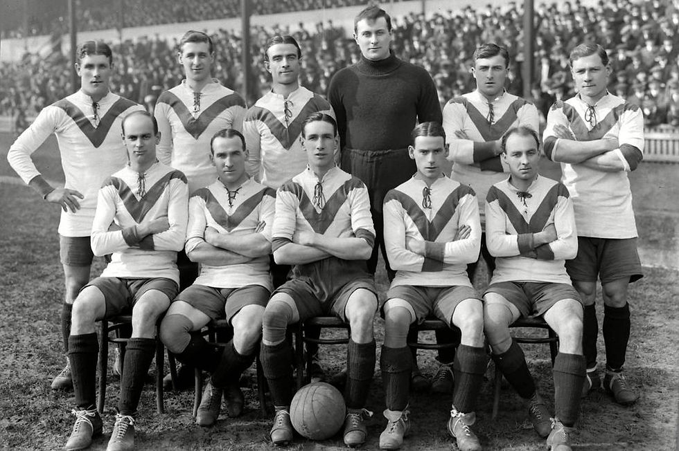
London’s second oldest professional football club, the Leyton Orient we know today grew from humble origins, beginning in Homerton in 1881 as Glyn Cricket Club. Changing many times
throughout our 140+ years, the Club has overcome great obstacles and achieved tremendous successes.
It was a pleasure to oversee a project coupling the club's vibrant history and exciting future to create a brand that reflected its status as an icon of London's east end.
A brand goes beyond typefaces and pantones, it represents the values and identity of an organisation. The branding project with Leyton Orient made no exception to this, ensuring each stage of the process was informed and true to the spirit of the club and its community.

Leyton Orient's rebrand was a 3-year project to build a consistent and unmistakable identity, showcasing every unique aspect of the club and celebrating the stories and heroes that have made Orient what it is today.
The fresh brand would proudly bring The O's' rich history to life, ensuring the club's heritage was fundamental to its identity as it continued writing new chapters in its remarkable story.
Orient's modern-day achievements on and off the pitch were also integral to the branding project. From glory, glory tales of silverware, to the ever-growing community supporting the club, Leyton Orient's upward trajectory continues to impress as it cements its place as one of the most exciting clubs in the country.
THE RESULT
The successful re-brand of Leyton Orient led to the club adopting a new approach to all its following work in all areas of the club. During the following website and app launch, marketing campaigns, retail refresh and streaming product launch, the club's core identity was considered and utilised like never before.
A key to Orient's rebrand was developing a library of creative assets that would be easy to use for all those around the club. This ensured the club's brand was consistent and unmistakable, as intended at the beginning of the project.
The final result was a clean but impactful brand that reinforced Leyton Orient as one of the icons and greatest assets of not only the club's local community but the whole of London's East End.
jake.cook97@outlook.com
+44 7584419097